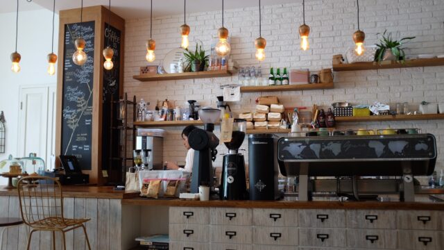
The packaging design makes the biggest difference, and if the brand makes the wrong decision, they risk their product being unsuccessful. If you are opening your new coffee shop, then you probably know that the way you design the packaging for your product can bring you a lot of new customers.
There are thousands of shops that sell this beverage, and it is hard to come up with something new and unique. To help you out with your goal, we are going to give you some creative ideas and some tips on how you can choose the material, color, and overall design of the bag or the box you are going to put your product in.
1. Color coordinate
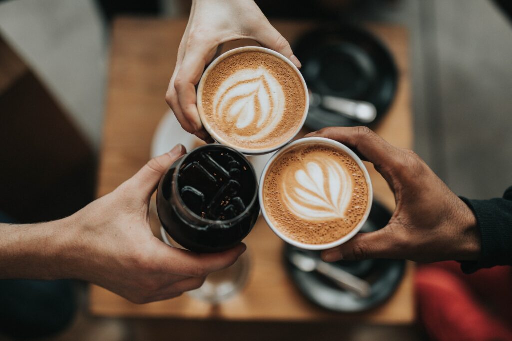
People are attracted to different colors, and they are more likely to choose a brand if they know they don’t have to spend a lot of time looking at the fine print to see what type of coffee they are buying.
We usually think that the darker the bag is, the stronger the coffee, and, opposite of that, the lighter the bag, the more creamy or milky the beverage is. So, you should use that to your advantage.
When designing the packaging, try to use different color schemes to help customers find what they need. This does not mean that you should use the same colors other people do or that you have to color the bag or the box in only one color. You can put a stripe or a square on the packaging that represents how strong the ingredients inside are.
Your brand will be more recognizable that way and people will choose it just because you went one step further to make things easier for them. If you use a blend of different types, then you can put several different stripes of color and help users see what’s inside.
Or, if you don’t want to rate the beverage by how strong it is, you can do the same color coordination for different types. For example, cappuccino or latte can be beige, espresso and americano can be brown and arabica and the original black coffee can be dark brown or beige.
2. Choose the material carefully
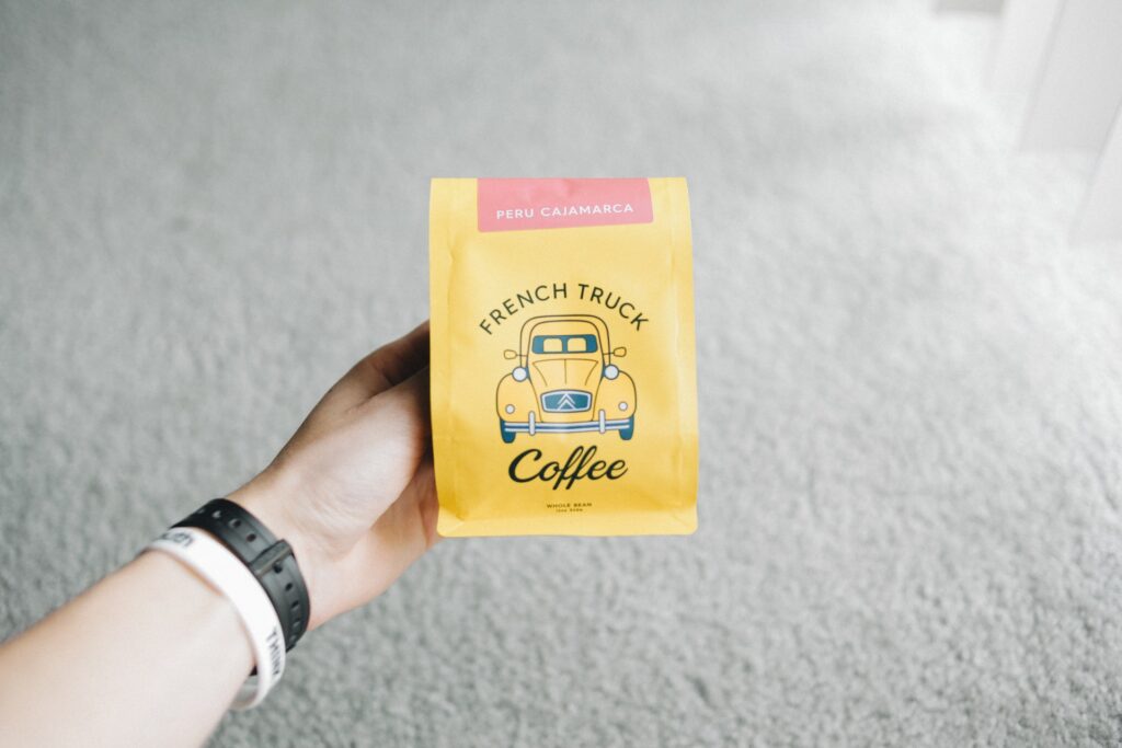
The material is more important than the whole look of the packaging. When you present something in a durable material and something that will not get damaged with use, people are going to come back to your brand over and over again.
Not everyone wants to repack their products when they come home, and most of us tend to keep the product in the same packaging that we bought it in. So, if you present something that cannot be reused or that it gets damaged when it is open, chances are, people are going to go with a different brand.
Hibags suggest that coffee bags that come with a valve are extremely convenient and they are easy to open and close over and over again. The paper bags are also really neat and durable, plus you can use different materials and leave a transparent window in the bag so users can see what is inside.
Spend some time choosing the right material for your product and don’t settle for the first thing you find on the market.
3. Use a unique shape
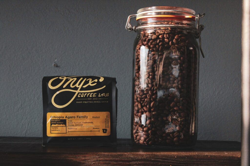
If you want to be better than your competition, you have to go one step further. The way you design the packaging is going to make a lot of difference, and when you placed something that’s not already seen and used by others, people are more likely to go for your brand and try your product.
Coffee roasters are something that’s easy to design, they are practical and they are different. Most of the products we buy are in a rectangular shape, so when we see something that’s not like that, we are more likely to buy it. Plus, when you use a cylinder, you make the whole product look visually bigger, and you can target an audience that believes that bigger is always better. Make sure you use the right materials so you don’t negatively impact the environment.
You can also go with square packaging because these shapes are smaller, more compact and they are easy to place and keep anywhere. Combine with the right colors and customers will love the overall design.
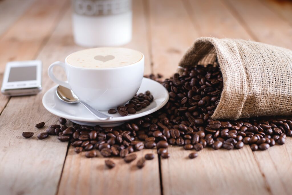
If you want to keep the standard shape, then focus on what is going to be on the package. Some brands like to put a scenery picture of the place the coffee originates, and others just use their brand colors and logo. See what works best for you, and find that combination of trustworthy and unique.
You can even try something extremely unique, or create the packaging in the shape of a coffee bean. This may be a bit trickier to execute, but if you are interested in presenting a luxury product and pay attention to even the smallest details, this is going to be worth it. You can also sell mini packaging for one use only, and you can play around with their shapes as well. The mini products are easier to design and to execute. Even if you use a generic shape for the larger products and present something unique for the miniature versions.
Some brands choose to combine the cup with the beverage, and you don’t have to stick with the cup only. You can pack it in a mug, reusable cup, bottle or anything else you feel will attract new customers. Combine all of these things, and don’t forget to conduct several surveys and see what your customers think about your new ideas.
Don’t look at the overall packaging as something that you are creating, instead, think like a customer and try to see things objectively. You can see what your competitors are doing and get some ideas on what you can incorporate or what you need to stay away from. Listen to your customers and if they don’t like something, don’t try to force it. Choose a packaging design that will represent you, your vision, ideas, and what your brand represents.


