Animation is far from a new phenomenon in web design. Already no one is rejected or surprised by the I-shaped cursor in text editors or the shake-up effect in authorization forms.
But this is generally speaking. What else does animation do? There are top web design services to be used.
1. Links change and context
First of all, the main purpose of the animation is to explain the changes that occur on the screen when interacting with the site. Create context.
That is, animation makes changes visible, “tangible”, thanks to which the whole design becomes more intuitive.
In the animation, we first see the action, and then its result.
It’s all about the features of the human brain. In fact, he is very lazy and much more comfortable when shown, not told.
The animation just gives us the necessary clues and context that connect what is happening on the site together, masterfully hiding the flaws of the interface itself. Animation helps a person not to get lost on the site and quickly achieve their goals.
Again, this is the sacred principle of web design “Don’t make me think.” And, really, there is no need to think – the moving elements will clearly and clearly tell you where to go and what to do.
2. Attracts and directs attention
It goes without saying. It’s hard to ignore elements that move. But animation is not just something that “wiggles”. It helps the user to see the result of his actions and influences his behavior.
3. Helps convey emotions
Animation does a great job where words don’t work. Basically, it is a new universal language for expressing emotions and explaining complex concepts.
She adds subtle nuances of meaning that cannot be expressed by conventional means. At the same time, moving elements allow you to bypass many stereotypes.
The animation is attractive, but not too real – which makes it the perfect bridge to unfamiliar concepts.
4. “Brightens up” sites and applications
Sites and applications must have a connection with the physical real world, then they will be more willing to use them. Here we are already talking about mental models and skeuomorphism when we transfer the properties of a real object to a digital one.
The same principles work with animation. In addition, it makes the design more coherent, eliminates the barriers between thought and interface.

5. The main principles of animation in UI design
The animation that we all know and love got to interfaces relatively recently and did not appear immediately in web design itself. For a long time, it existed only in classic cinema and cartoons, from where it originates.
Of course, movie animation and website animation are not the same things. However, there is a lot to learn here and most of the principles apply to interfaces as well.
6. Timing and pacing
Shows how many pictures or frames the action takes.
Timing is our everything. It is critical for creating a character’s mood, emotions, and reactions, reflecting its individual characteristics. And most importantly, this kind of timing game makes objects more realistic.
In the ordinary physical world, transitions tend to have intermediate states that communicate how things work. Turning the knob signals that the door will now open, and clicking the kettle’s button signals that the water has heated up. We know this and calmly react to such signals.
7. Staging
The purpose of stage performance is to prepare the viewer for what is about to happen and to draw attention to a key point or idea in the scene. That is, we direct the person’s gaze to what is important right now, but without unnecessary detail.
In cinema, this effect is achieved by placing characters and images in a specific order, playing with light and shadow, and the angle and position of the camera.
8. Number counter with rounded progress bar
How does it work in interfaces? Take the number counters that are common on various sites.
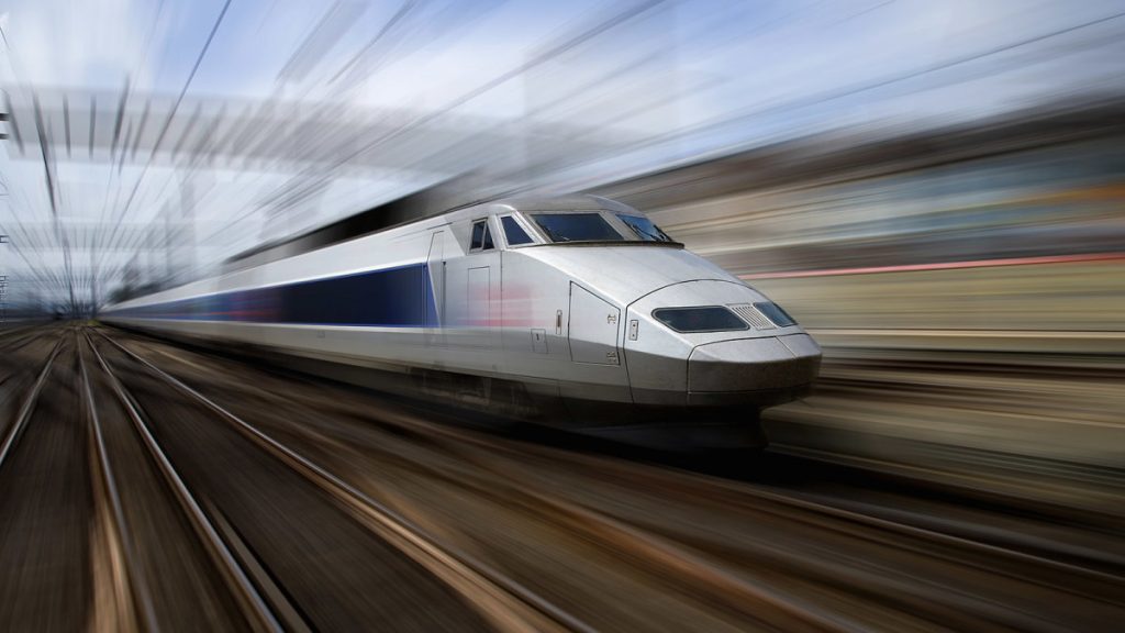
Such counters should be as similar as possible to the countdown boards of airports and train stations and manual mechanical counters. These mechanisms are equipped with special scales that display the movement of trains in real-time or the amount of energy consumed.

9. Follow-through
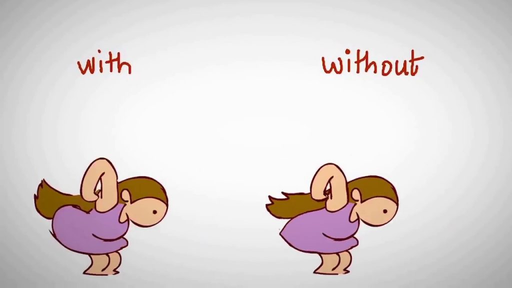
This technique makes everything that happens more realistic and gives the impression that the characters obey the laws of physics. “Through motion” means that parts of the body will continue to move even after the character has stopped.
In the UI, this effect can be achieved by slightly deflecting the object from the endpoint. The trick is simple, but you will get the feeling that objects have weight and they lend themselves to friction. Thanks to this, the interface will become closer to the real world, filled with soft and imprecise movements, and the animation will be smoother. More details are on https://fireart.studio/blog/10-best-website-animation-techniques-for-your-web-design/.
10. Secondary action
Secondary actions give the scene more life, add interesting little things.
The important point is that this action is independent of the main action. Such details should not distract attention from the main action and cancel it. Their main task. on the contrary – to emphasize and complement.

11. Overlapping action
In classic animation, and overlapping action is one that begins before the previous one ends. That is, there is a kind of “overlap”.
More specifically, the overlapping action shows the offset in timing between the character’s body and its individual parts (clothing, body parts). This technique helps to diversify the animation and make it more interesting.
12. Appeal
It is clear here: attractiveness is what will make the character brighter and livelier, more human, what will attract attention, his unique features: a humped nose, prominent jaw, big eyes. Simply put, charisma.
On the site, accordingly, this principle is expressed in bright interesting details, unusual design, icons, and fonts. Not every element should be functional, have a connection with the real world and solve some problems.
Such “attractive” elements include everyone’s favorite social media like icons or swipes on various devices. In principle, they do not carry a special functional load (although a swipe makes it easier to navigate a smartphone or an application), but thanks to them, the interface becomes more memorable.
To sum up
Sophisticated animations bring the interface to life, making it more expressive and intuitive, and making the elements familiar and tactile.
It is built on the same principles as classical animation in films and cartoons: you need to transfer the properties of real objects to virtual ones, add soft and inaccurate movements, transitions between states, and bright unusual details.
Of course, the animation is great, but now you shouldn’t ignore all other content and “screw” moving elements into place and out of place.
Read Also: Questions to Ask Before Selecting Your Web Designer


