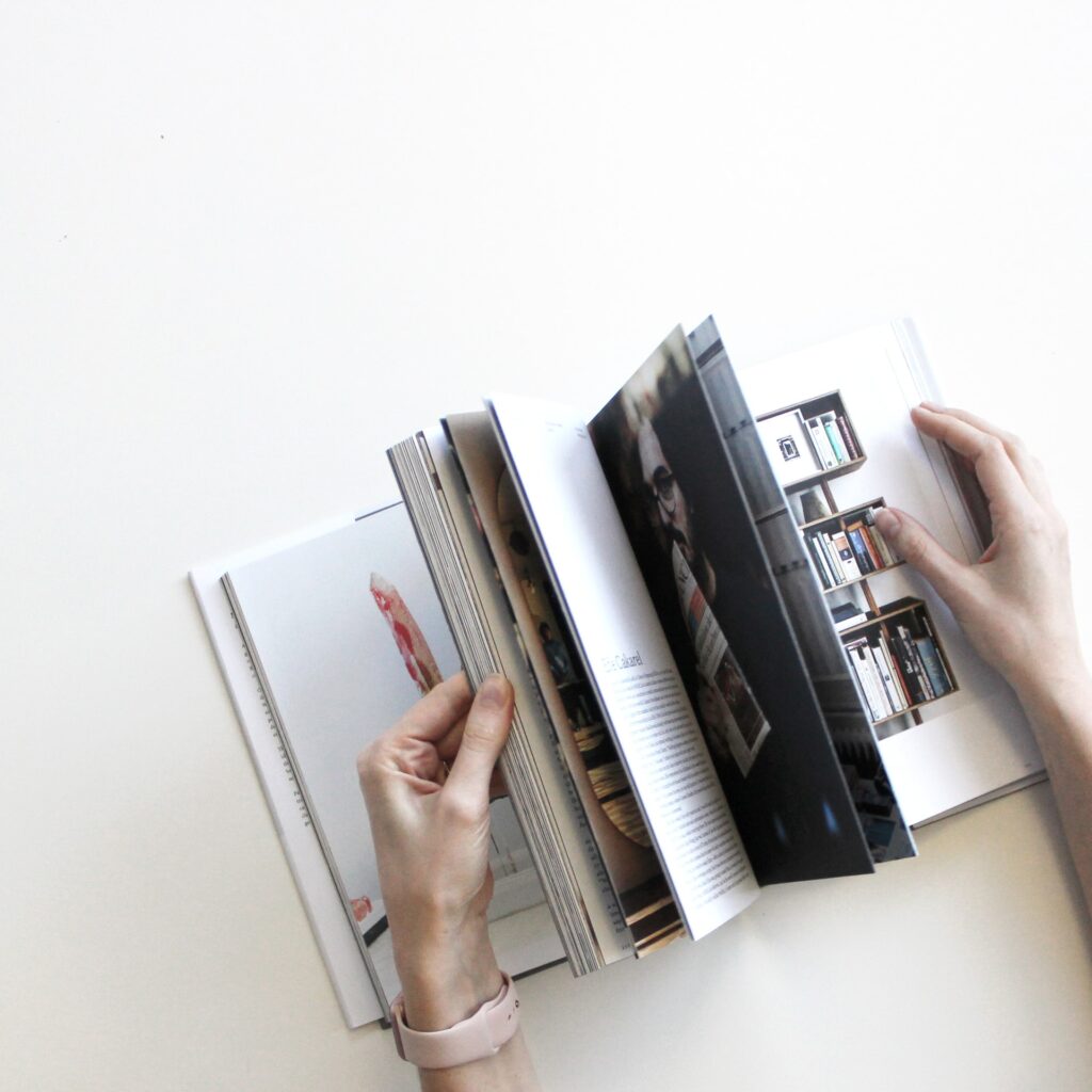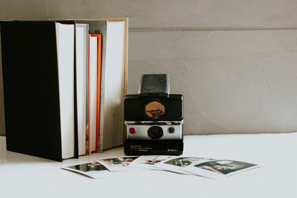
Photo books can be a great way to store your most precious memories. If you want to make a photo book, you will need the services of a MixBook. There are plenty of sites and applications that help in making photo books very easy.
The following are some tips you can use when making a photobook:
1. Have a Budget

Before you start using a photo bookmaker, you should create a well-defined budget. The budget will be your financial guide to ensure you don’t spend too much on frivolities, or you don’t get into debt making a photo book.
The vast majority of photobook makers will charge you a few dollars per page. Having a budget allows you to determine the best rates and how many photos you will need.
It will also help you determine the layout of the photobook.
2. Take Your Time
A grave mistake many people make when using a photobook maker is that they rush through it. There may be a deadline when you need to have your photobook, but that is not an excuse for doing things in a hurry.
Take the time to explore the bookmaker and find out the full extent of its capacities. By doing so, you will produce better photo books as you will know what to do. However, if you have limited time, you can use online photo bookmakers like PrintedMemories to help you automatically create a meaningful photo book. You can even create a photo book straight from your Facebook and Instagram account in only a few clicks away
3. Choose your software carefully

As an amateur, you might not consider this important because there are so many options available on the net. Well, that’s precisely why you need to ponder over it and then opt the one most suitable to your taste and comfort.
Moreover, good software would inform you if your pictures are too small for a spread design. It comes with a plethora of downloaded templates and layouts. You might have to put in a little extra effort to find the one that fits your budget.
4. Look for Unique Features
If you want to make a photobook that sets you apart from the pack, you need a service that offers unique features. The more features a photobook maker has, the more unique your photobook is likely to be.
You should be creative in using such unique features of the service. However, refrain from using those that cost you a lot of money.
5. Fill out the pages or go for non-white backgrounds

Having a picture that completely covers the entire pages looks much more professional and polished than leaving background spaces. You can also vertically crop the photos so that you can fit them in a single layout.
Still, if you wish to leave some space in then the background, try not to use white to make your pictures dull. You can go with something neutral, like grey, or solid colors to make your photos pop out.
6. Don’t use too many texts
While making a photo book, you have to keep in mind that less is often more. To make your text appear more polished and classy, try to stick to a maximum of 3 different types for the main titles, subtitles, and body content.
Moreover, your words or short quotes can help you to better express your story. You can even write on the pictures itself.
7. Use Templates
Unless you have a specific theme in mind that you would like to include in your photobook, coming up with a design can be very difficult. Therefore, you should use templates provided by the photobook-making site you choose.
The templates should only be the starting point, and you should be as creative as you can after that. Many sites have great templates that can result in innovative designs if you use them appropriately.
8. The exterior of the book is equally important

You should never judge a book by its cover. However, a good body can be beneficial for you. It tells a lot about what kind of impression you want to leave on the other person. Additionally, it describes the tone and direction of the book.
Moreover, earlier, you didn’t have the option to extend your cover photo up to the spine, but now you can do that as well. Plus, avoid center-aligned text on the spine. Instead, right the year at the bottom for more efficient organizing.
9. Avoid pixelated pictures
You have to use pictures with too high-resolution for your book. With blurry or too small images, you can’t achieve that gorgeous two-page spread that everyone adores.
Moreover, while printing, always take the extra glossy pages only. As compared to the matte version, glossy pages give you better colors as well as superior quality. On top of that, glossy pages are way thicker and durable than matte ones.
10. Preview the Book Often

You should preview your photo book as often as you can when making it. It is rarely the case that a photobook is complete in the first attempt.
You need to preview the book to ensure that you remove any mistakes you have made. That will include photographic errors as well as errors in the text or captions included.
You can also do it to improve your design and make it more aligned with your theme.
11. Leave some space in the end
You can leave a little space here and there to include some rare items to make it more personalized. It could be simple mundane things that hold significant value for you. For instance: movie tickets, sticky notes, brochures, and so on.
However, remember to put only comparatively flat things. So, that you don’t end up damaging the spine of the book. Some people might like to add songs in a CD or thin Pendrive to reminisce the old songs.
12. Edit Pictures Separately

Though it is a photo book, you should begin modifying each picture individually. The better the individual images, the better the photobook is likely to be.
Pictures may be over enlarged, out of focus, or blurred. Editing them before using a photo book, making software will ensure that the picture quality is optimized.
You are then only left to ensure the pictures are well aligned and match the theme.


