These designs must have looked great on paper because they don’t look good in execution… at all.
Architecture is an art, but when things get experimental it can get a little scary. It’s easier to paint over a canvas than to demolish a building, so if your ground-breaking design becomes an eyesore it may stick around a long, long time, like these eleven examples.
11Chang Building (Thailand)
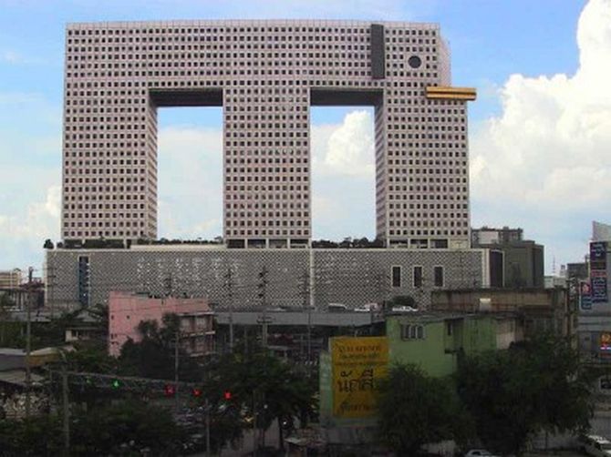
The intended effect was to have the building resemble an elephant, but it simply doesn’t work for most viewers. But the Chang building does get robust use, servicing apartments, offices, a bank, a shopping center, and more, so in that regard, it’s still a success.
10Selfridges Department Store (England)
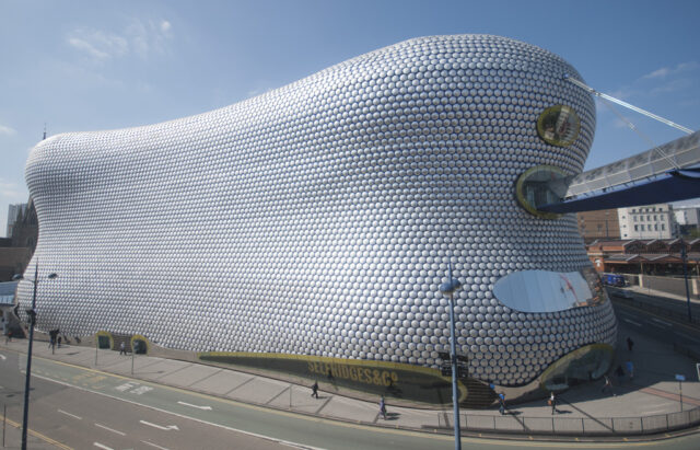
This historic chain prides itself on unique architecture for its stores, but the Birmingham location has many, many vocal critics. The design appears to be some sort of futuristic beehive, a look achieved through the use of numerous aluminum discs on the exterior.
9Ryugyong Hotel (North Korea)
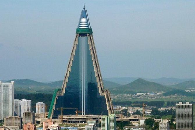
This one-hundred and five-story triangular skyscraper come with a shaky history: work began in 1987 but ceased in 1992 after the fall of the Soviet Union. By 2011 the exterior had been finished, but that appears to be it. Locals are said to not even acknowledge the building’s existence to tourists.
8Walkie Talkie (England)
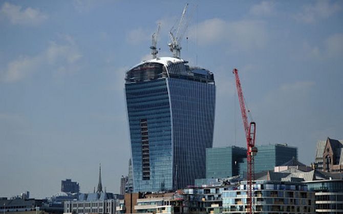
This skyscraper has more problems than visual aesthetics: its shape reflects sunlight onto the streets below, creating direct heat strong enough to cause damage to other buildings and parked cars. One driver was even awarded damages when part of their car melted.
7Antilia (India)
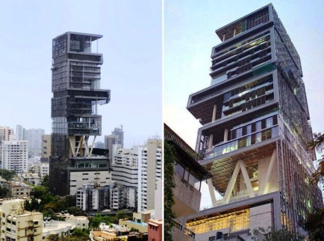
This is a home in South Mumbai, the world’s second-largest private residence (the first is Buckingham Palace, by the way). It maintains a staff of six-hundred people. At $1,000,000,000 the building is only twenty-seven floors (with ten elevators). Meanwhile, other buildings of the same size have sixty floors.
6EMP Museum (United States)
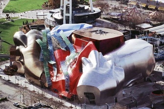
A pop-culture museum featuring an 800 seat concert venue, the EMP has drawn comparisons to a smashed guitar (apparently an homage to Jimi Hendrix). But some critics are less enthused. The New York Times called it “something that crawled out of the sea, rolled over, and died.”
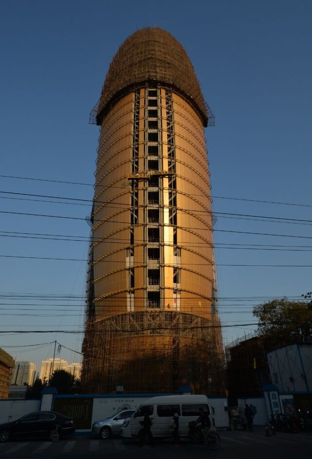
The People’s Daily is the major newspaper of China and has been since 1948. It’s so important that it’s published in at least thirteen languages. However, none of this explains why its main building is shaped like a massive penis. Make of that what you will.
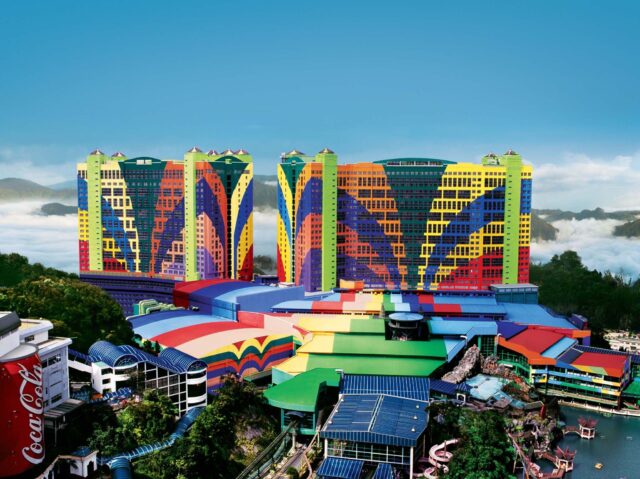
With a whopping seven-thousand, three-hundred and fifty-one rooms, it’s the largest hotel in the world. But clearly, none of the stars from its three-star rating came from its exterior color choices. It’s like the building itself is wearing a tacky vacation shirt.
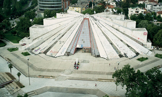
Originally built as a museum to honor Enver Hoxha, the country’s first communist leader, this building has been re-purposed many times since 1991 and has since had all references to Hoxha removed. The exterior has fallen into disrepair and is covered in graffiti, which should tell you everything you need to know about the man’s legacy.
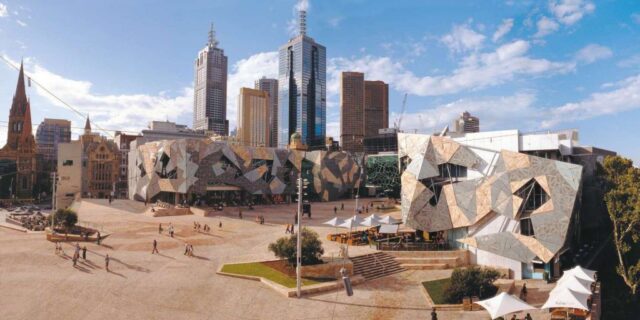
This Melbourne development is massive (3.2 hectares), making its unsightly features that much worse. Though the functions of the facility are appreciated the most common criticisms are that the design is overly complicated and the exterior looks disheveled.
On one hand, you can forgive the design for being difficult if that’s the point (the school claims it promotes “tolerance through chaos”), but for some, that’s simply too hard to accept.

