There’s a science to making album covers. In many cases the image used is the first thing a customer will know about that particular album. There’s really no guarantee to the perfect cover, though there a few rules that record label executives go by: avoid holograms, don’t be the Monkees and sex sells. With the third rule, its not as easy as one would think. Sure, people like sexy things. That’s because they remind us of sex. But did you know that sometimes things can be unsexy as well, and people generally don’t respond well to unsexyness? Again, its so obvious that it shouldn’t need to be stated, but looking at some of these covers it’s obvious that someone in the planning process was phoning it in.
10.
Prince – Lovesexy
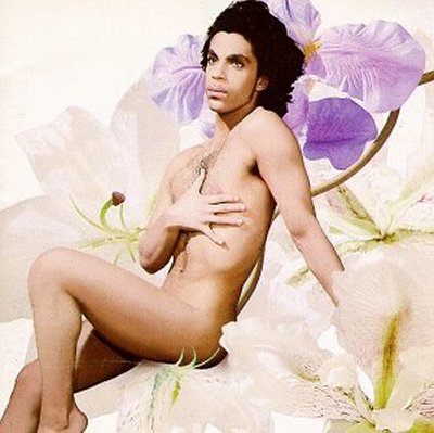
I’m not going to argue that Prince isn’t a sex symbol because I’m pretty sure the scientific community at large has widely accepted the opposite to be fact. I’m also not going to imply that Prince is somehow unfamiliar with the art of being sexy because as I write this with a Cheeto in one hand and a can of PepsiOne in the other, he most likely can’t find the nearest exit of whatever room he’s in due to the constant stream of naked women that surrounds him. Instead, I will simply suggest that no other musician should even attempt to parody this cover, not out of respect, but our of shame. If posing like some sort of sprite on a bed of flowers can make Prince, a man who once wore raw meat and women’s shoes on stage, somehow look absurd, the boys of CCR don’t stand much of a chance to properly pull it off.
9.
Nashville Pussy – Let Them Eat Pussy
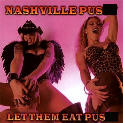
Nashville Pu$$y are out on a mission to prove that subtlety is an elusive art form and that class is incredibly overrated. Either that or their fan base are a collective of the most horribly dense people on the planet. Despite using the word “pu$$y” twice on the cover in a large bright font, those fine southern gals decided to go all in and bank entirely on the sex-sells school of thought. Apparently, it worked, so good for them, but that doesn’t change the fact that the woman on the left looks as though she’s attempting to kill that poor man with her va?*na.
8.
Trina – Da Baddest Bi*@h

In an effort to show just how many people want to b@ne her, Trina throttles a man who is either dead or dying, perhaps as a result of the sexual assault he’s being subjected to. To her credit she’s at least trying to revive the poor guy but God only knows what she’ll do with him if he manages to stabilize. I’m also going to make the bold accusation that she isn’t medically trained given that a nurse rarely reads a patient’s vital signs with their sex organs.
7.
Richard & Willie – Funky Honkey, Nasty Ni**er
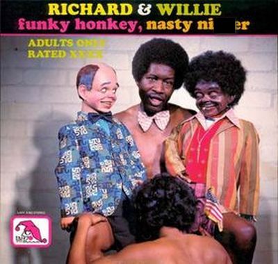
I’m not even going to question whether or not racist ventriloquy has a sustainable fan base. If the answer is no then I look like a fool for asking, but if the answer is yes then I have something entirely new to fear in my everyday life. But back to the picture: how many album covers manage to incorporate a love for fellatio, puppetry and bigotry into a single perplexing image? I’m pretty sure this is the only one and rightfully so because what the hell. However, I’m not sure which is more difficult for me to accept: that the man is somehow capable of performing ventriloquy while being the subject of an explicit sexual act or that his funky honkey associate is giving him the most eerie look imaginable while he does so, peering into the very depths of his soul.
6.
Cerrone – Cerrone’s Paradise
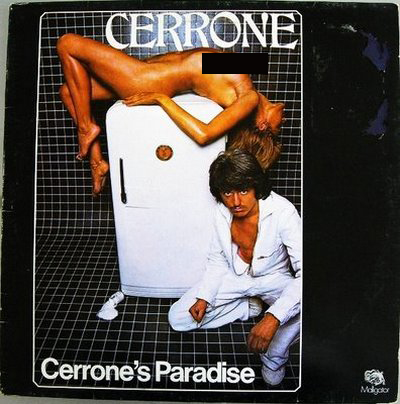
Cerrone’s managed to gather several elements of a horrific crime scene into a single image for the sake of selling music: a seemingly lifeless body, a refrigerator to stuff it into, mysterious white fluid and a deviant with a mustache. In fact, I’m pretty sure all of those things factor into forty percent of every episode of Law and Order. Usually, Gerald Brisco sees the body on the fridge, shakes his head and says something witty like, “Looks like she got iced.” That’s the sort of sensitivity that only comes from the boys in blue at the fictional New York Police Department.


